Daily Dose Web Design & Development
- Matie Natov

- Jul 7, 2017
- 3 min read
Updated: Apr 29

Empowering 17K+ Employees with Faster Training
Increasing User Engagement by 80%
In 2018, as a full-time Graphic and Web Designer for one of the world’s largest beauty retail companies, I was entrusted with the challenge of redesigning the Learning Management System (LMS) used by 17,000 employees across the U.S. and Canada. My goal was to simplify and optimize the platform’s Daily Dose training modules, enabling employees to focus on their work while staying up to date on essential training.
Transforming the Education Department
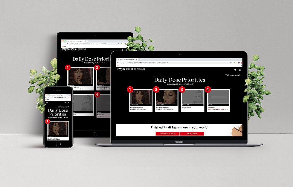
The education team faced significant obstacles. Store managers reported that employees were overwhelmed, spending over 20 minutes per shift navigating the Daily Dose platform. With training completion rates averaging only 17%, it was clear that the system needed a major overhaul. My task was to revamp the LMS homepage—the central hub where employees accessed their training modules—to create a more focused and efficient experience.
The "Before" State: A Cluttered Interface
The original LMS homepage was complex and disorganized, resembling a streaming service with too many options vying for attention. This left employees feeling lost, frustrated, and unable to complete their training within the limited time available during their shifts.

A Strategic Redesign: Simplicity and Efficiency
To resolve these challenges, I worked closely with managers and directors to design a new interface that prioritized:
Clear prioritization of training modules, ordered by importance.
Bite-sized content delivered in fewer, shorter modules per week.
Streamlined navigation that minimized decision fatigue and improved usability.
The new layout allowed employees to complete their training efficiently within their limited available time.

User Research: Listening to Employees
To ensure the redesign addressed real user needs, I conducted extensive user research. This included interviews with employees from multiple store locations across the California Bay Area to understand their challenges, preferences, and feedback. Key findings included:
Employees felt overwhelmed by the previous design and didn’t know where to focus.
Many had just 10 minutes per shift to complete their training.
They wanted a simpler, more intuitive platform that fit into their busy workday.
Armed with this knowledge, I created user personas representing the primary user types and mapped out a more focused user journey.

Prototyping the Solution
I translated employee feedback into actionable design concepts, starting with paper sketches and evolving into high-fidelity prototypes. Using custom HTML, CSS, and JavaScript, I developed a clean and functional web interface that emphasized usability and efficiency.
Aligning with Brand Campaigns
To enhance engagement, I collaborated with other departments to align the training interface with seasonal marketing campaigns and in-store promotions. This integration created excitement around training and ensured that the design remained relevant and visually cohesive with the company’s overall brand strategy.
The Results: A Game-Changing Redesign
When the new LMS interface launched, it was accompanied by a user feedback survey. The results were outstanding:
92% of respondents rated the interface as easy to navigate.
Training completion rates surged from 17% to 75%.
The time spent on training was cut in half, dropping from 20 minutes to just 10 minutes per shift.
The simplified interface not only improved employee engagement but also streamlined how the education team delivered content, creating a win-win solution for both employees and management.
Lessons Learned
This project demonstrated the importance of user-focused design and cross-department collaboration. By listening to users and prioritizing their needs, I was able to create a solution that transformed the training experience for thousands of employees.


